MODERN FARMHOUSE IN THE EAST
Type: 3 Bedder Condo | Location: Tanah Merah, Singapore | Home to: 2 Adults & 2 Children
Designer: Nadia Shihan | Project Manager: Marcus Chia
A cosy and comforting family abode for an interracial family of 4; Having lived on rental rotation since setting roots in Singapore, our client approached BuildBuilt with the desire to remodel this space into the first home that they could truly call their own.
Mood Images
With the emphasis on comfort and casual living, Nadia put together a space that is easy on the eye and mind with a modern flair. Gravitating towards cool neutrals, the outcome was a fresh contemporary look that embraces natural elements and understated details. She strived to unify the spaces within the home through curated materials, colours and textures, resulting in a visually cohesive interior.
Material Palette
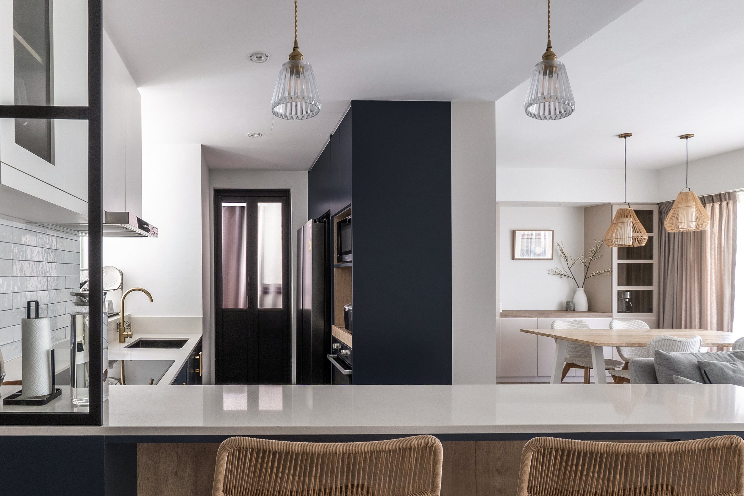
The base palette largely focuses on a neutral build-up, with an exception of a bold statement kitchen in a dark navy hue. These shaker-style cabinets contrast with white counters, polished brass handles, and sleek black frames for a clean and refined look. To offset that, we specially curated handcrafted tiles which exude a more natural and organic appearance. These key elements can be seen recurring throughout the home, helping us to achieve a tasteful balance between the modern and rustic.
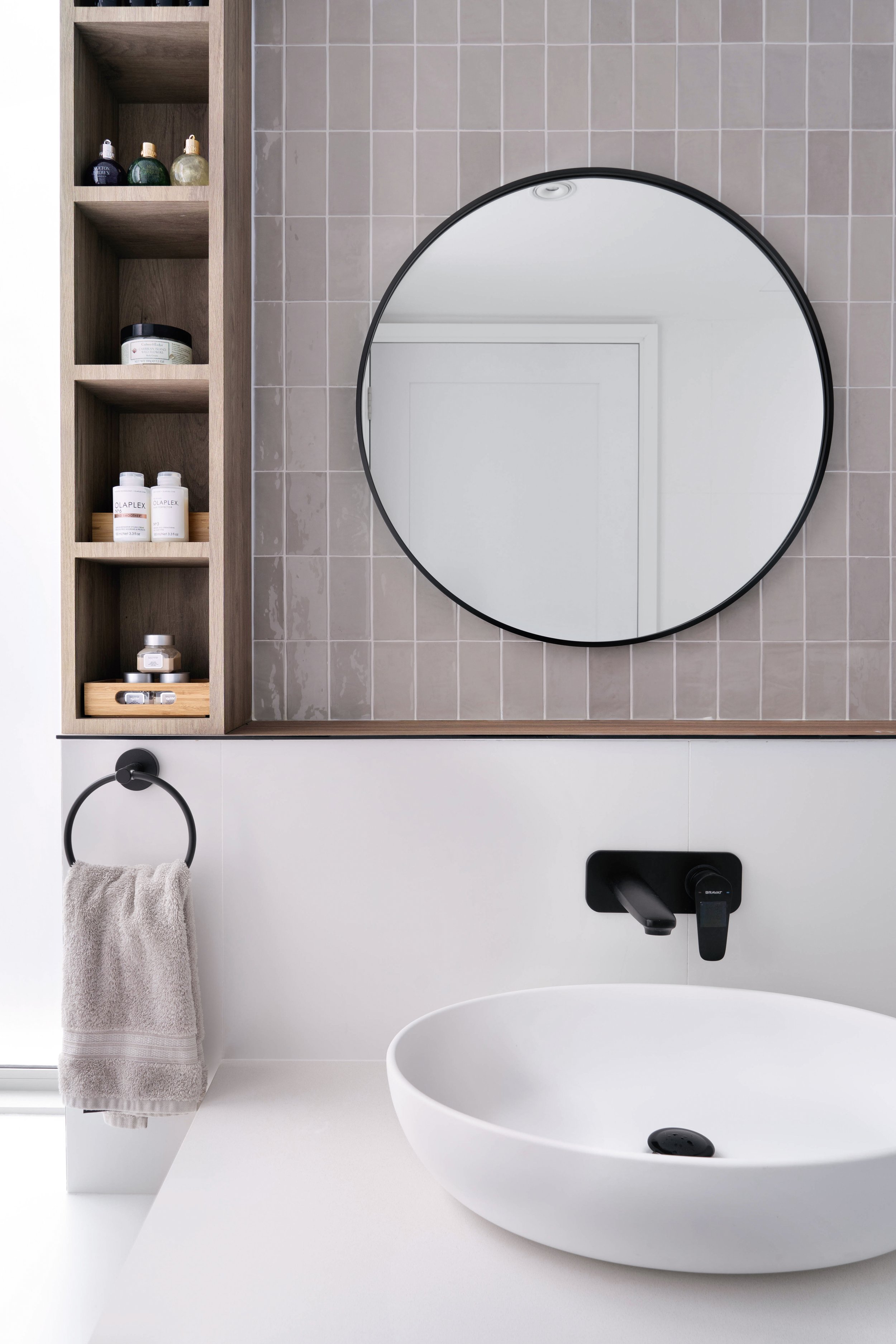
Splashes of colour were also introduced in muted tones across the bathrooms and bedrooms, complementing the characterful knots and grains of the selected wood.
Gradient/Tonal Variation and handcrafted shaped tiles exude a more natural and organic appearance.
Layout Plan
The most prominent layout change can be seen upon entry, with the glass encased double galley kitchen now transformed into a more open and enticing space. The breakfast counter presently sits along the entryway corridor, leading guests into the heart of the home. This particular placement of the counter also establishes a functional purpose to an otherwise ordinary transitional space.
Extending into an L-shape, the counters form another visual leading line inviting you further into the hub of the kitchen where the tall storage units reside. This keeps the kitchen front clear and free from bulky build-ups/appliances.
The living and dining were retained as an open concept space allowing visual and social connection across the room. Framed by a pantry/display cabinet in the background, this was a build-up specifically requested by our client to feature a selection of her favourite artworks on rotation. It also functions as the home’s designated coffee station.
One of the project objectives also included better utilisation of the bay window ledges for more functional purposes. By extending the built-in wardrobes with open cubbies that sit on the ledge, we introduced more accessible display and storage opportunities (especially for the kids!).
It carves out the space as a multipurpose area for play or unwinding with a book. Our clients’ penchant for display nooks can also be seen throughout the house, each featuring stylish decor or memorabilia from their hometowns.
Browse the full gallery below
Photography by Studio Mahogany


