Terracotta Mid Century HDB Design In Wood Accent at Tampines
Type: HDB | Location: Tampines, Singapore | Home to: 2 Adults
Designer: Kai Xuan | Project Manager: Nick
How does one balance having a home with separate rooms and huge furniture, while keeping it spacious and airy at the same time? That was the main issue faced by our designer Kai Xuan while designing for this resale 5 room unit.
The Brief
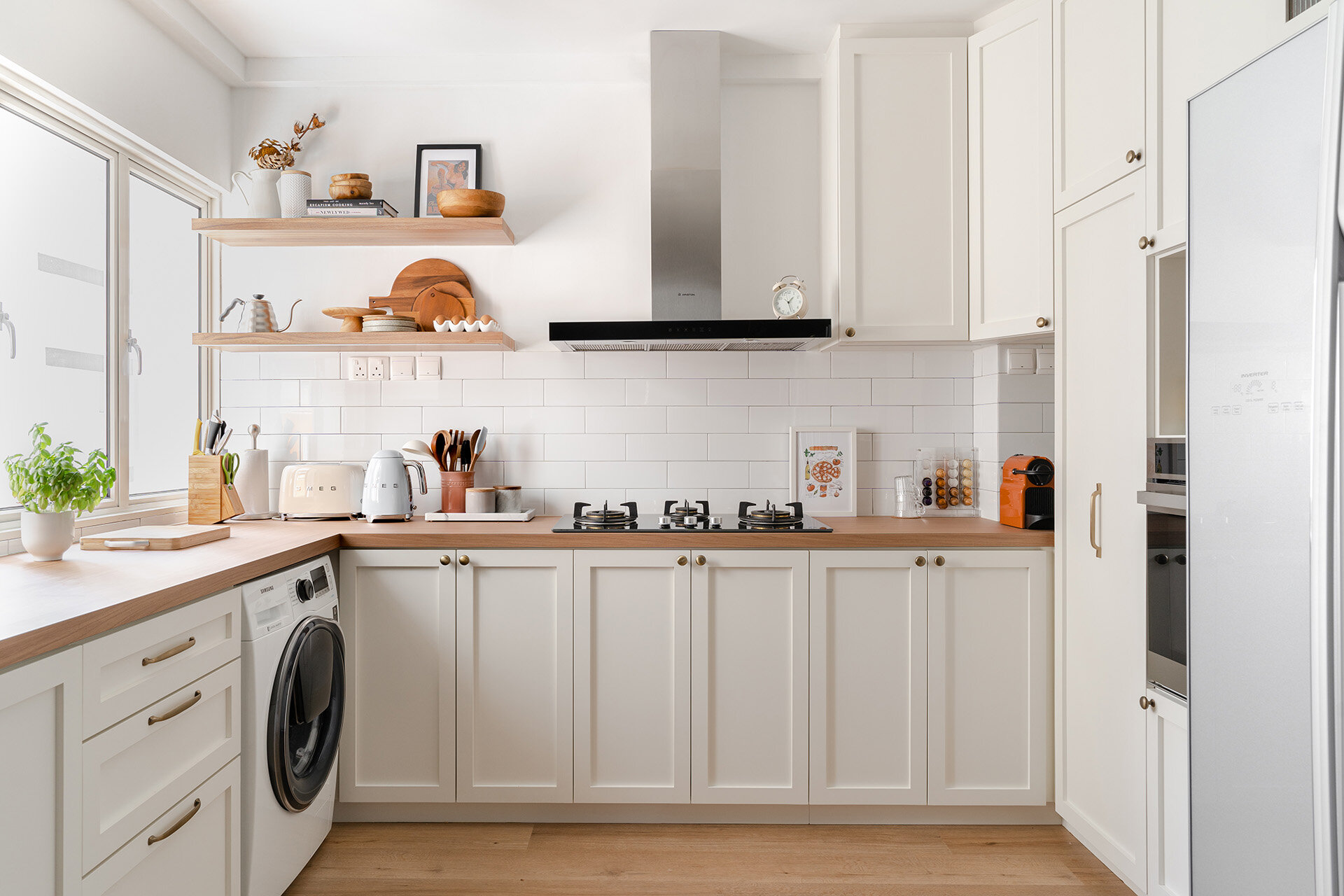
Our clients, a frontline nurse and the owner of an IT company, love cooking and baking, and requested an open concept kitchen. Built-in furniture was to be kept to the kitchen, walk-in wardrobe and living room. With 3 bedrooms, they are preparing to convert a guest room into a future nursery, and another to be their walk-in wardrobe.
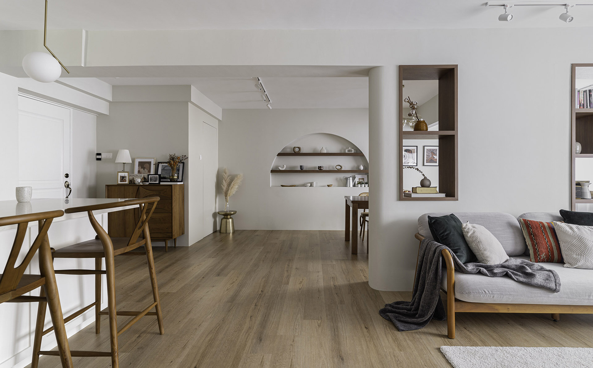
This challenging yet fulfilling brief required a creative take on the existing layout of the home. The result of hacking away selected walls creates an overall larger social area with adequate separation of individual spaces, which was crucial as our clients did not want a typical “studio apartment” type of open space.
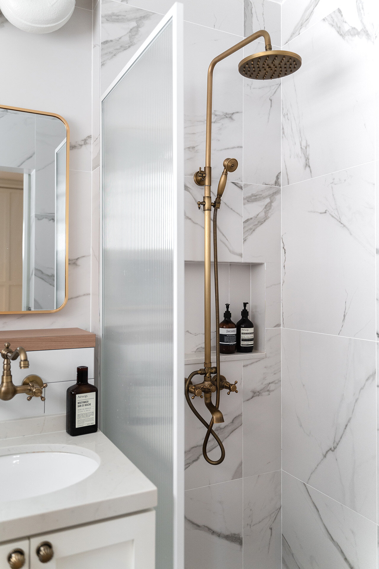
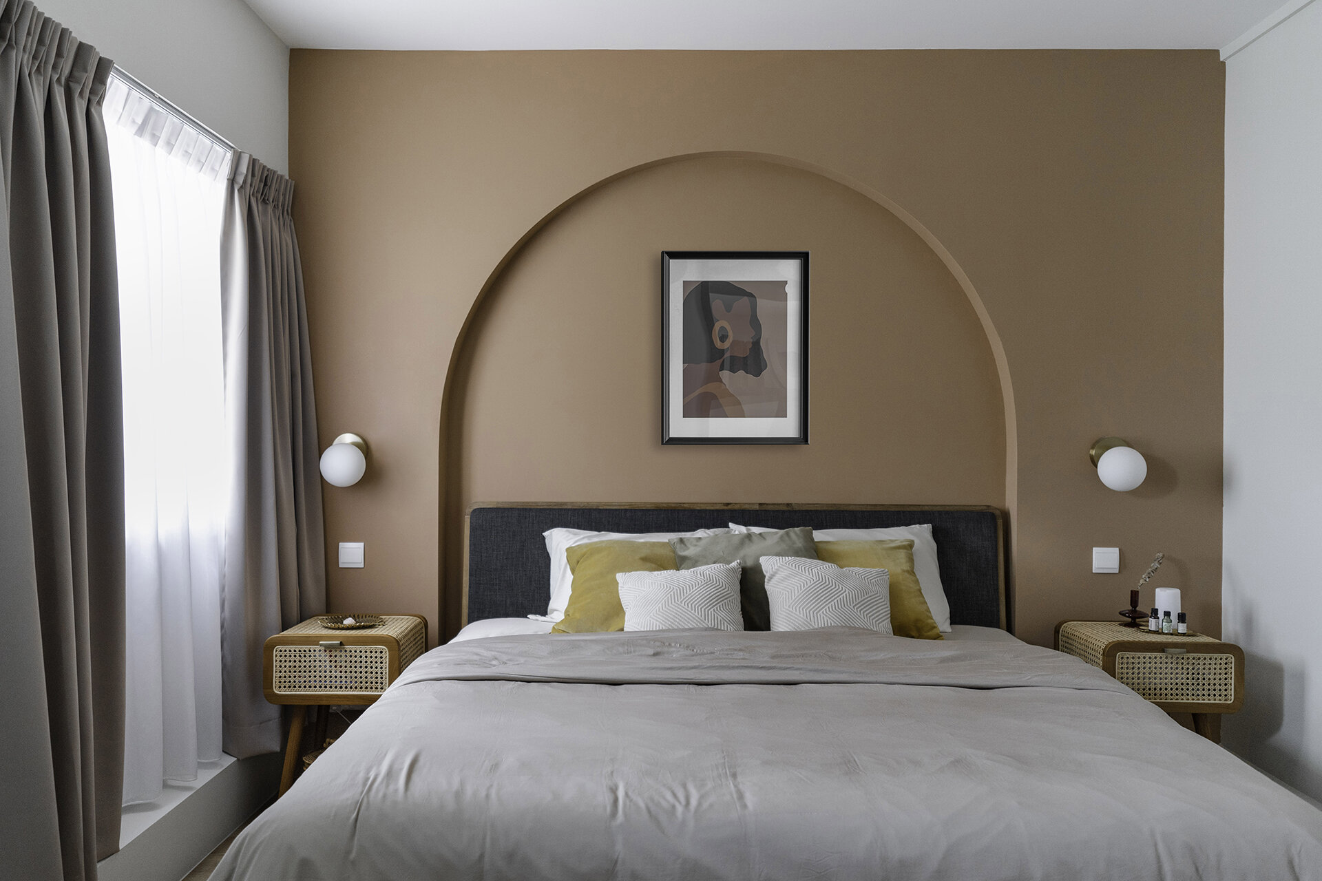
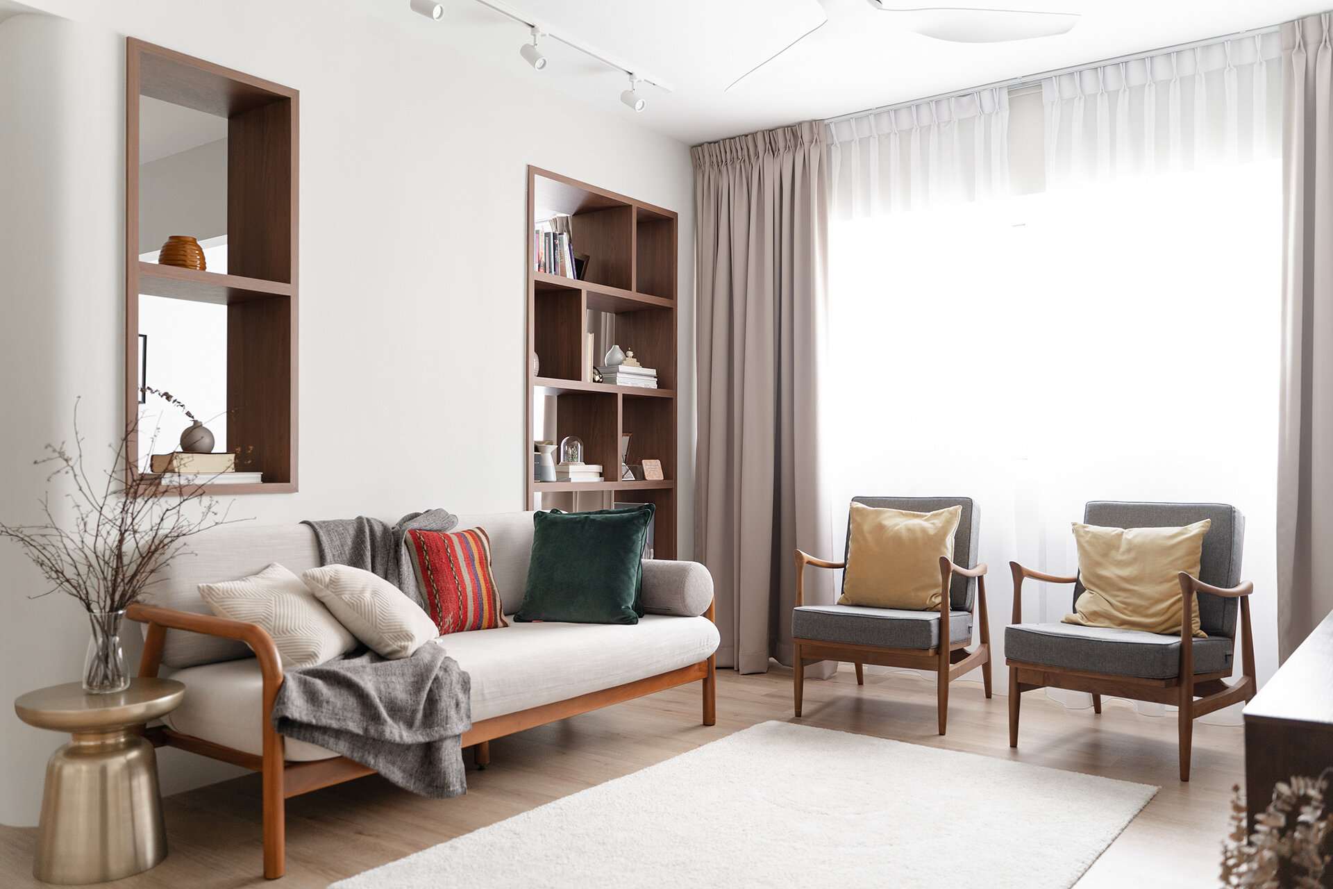
The homeowners wanted to have generous furniture inspired by the typical American homes, which resulted in a large, squarish kitchen island and an 8-seater dining table. We proposed a warm colour palette of terracotta, rattan texture, medium-toned wood and brass accents that complements the landscape of white walls and carpentry.
Working Around Restrictions
The original balcony space was a non-conventional kink that was difficult to reconcile. Eventually, the design reclaimed the entire area to accommodate the new dining space, now with the addition of a bench and a few whimsical plants.
A space to feature the couple’s expansive collection of tableware
Despite the advantages of the spacious HDB layout, typical wall kinks were still present which Kai Xuan solved by proposing a display niche. The feature arch has completely transformed an awkward wall into the highlight of the entire space, which now houses a beautiful collection of objects dear to the owners.
Definition without Segregation
To maintain porosity between different spaces, Kai Xuan also proposed a built-in shelf in the wall between the living and dining areas. The abundance of display spaces works well with the couple’s love for plants and art, which they often shift around to express their creative thoughts.
The original proposal was to divide the master bedroom and the adjacent room with a glass partition that could be concealed visually with curtains, while maintaining the overall spaciousness. The couple eventually kept the two rooms separate, with a walk-in L-shaped wardrobe in the master.
Art Corridor
Narrow corridors are any HDB owners’ nightmare, and this issue was mitigated by having recessed lights in the false ceiling and curved corners to make it more welcoming. With a prized artwork at the end, and space for future additions, this typical corridor is transformed into a cosy art walkway.
Bohemian Textures and Furnishing
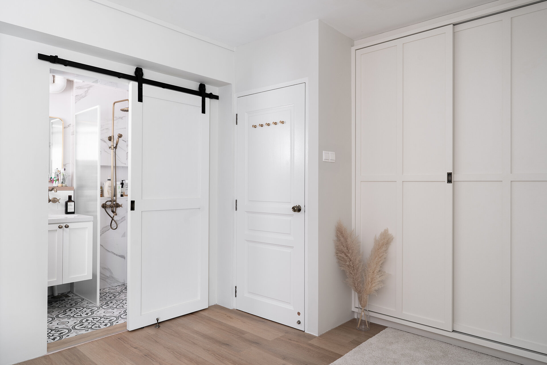
The bohemian style kitchen was completed with shaker cabinets and plenty of display shelves, while barn doors were chosen for the bathrooms. The dining area showcased even more character, with a table full of mismatched rattan chairs and an antique, tinted glass lighting above.
This design consultancy project was truly a fulfilling one, especially after the space has been lived in with the addition of personal touches and memories of the owners. Check out homeowner Rosalind’s Instagram for the beautiful lifestyle shots in this cosy home, as their home grows and transforms with them!
View the full gallery here:
Like this project? Make an appointment with us by filling up our questionnaire!
Explore more projects by Kai Xuan and Nick!


