In 2020, we were approached by a beautiful skincare brand, RE:ERTH. The brief was to design and build their first ever physical location. The project was to be located on Singapore’s bustling Orchard Road belt, in the legendary department store – TANGS. It was a breeze working with the RE:ERTH team throughout this process. The chemistry between teams during our brainstorming sessions were open and rejuvenating. Alignment with their brand came quickly through their clear narration of mission and vision.
Design Concept
RE:ERTH’s target audience has always been within the online realm. RE:ERTH was looking to this pop-up store as a physical stage to launch their new product and to promote brand awareness to their loyal fans, and potential new customers.

Image credit (from left): Aje, Tamburins, LABOTORY, Downshiftology
A space to reflect RE:ERTH’s brand aesthetics and represent its core values
RE:ERTH is grounded in a philosophy that advocates for nature-derived ingredients. We seeked to incorporate an authentic and organic feel in their store design. To align with the brand’s deep-rooted focus on restoring skincare and wellness stemming from the Japanese white turmeric, our design concept seeked to evoke a soothing and relaxed atmosphere for their patrons. This was achieved through the use of a clean and natural colour palette with a mix of soft neutral colours and botanical textures.
Store Layout
Given the limited space, we segregated the store layout into three zones to enhance its visual appeal and facilitate a smoother flow (human traffic movement) within the space.
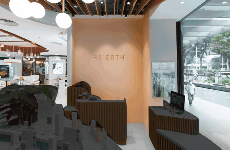
(i) Product display island Positioned at the store front within a clear line of sight; to display new and popular products, as well as promotional bundles.
(ii) Point-of-sale system
For ease of purchase, or to approach the staff.
(iii) Products Recycling point Providing ease of convenience for customers to drop off their used products.
Carpentry and Furnishings
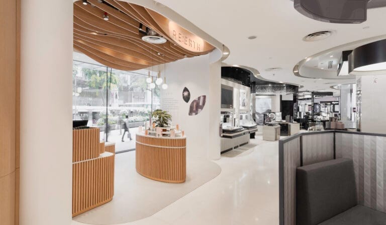
As the tenure of this pop-up store is temporary, the fixed carpentry would be kept to a minimal. Keeping this constraint in mind, we introduced standalone carpentry pieces in the form of layered and modular furniture, which can be dismantled and assembled for future use at other locations.
We also introduced undulating yet natural curves in the display island, layered ceiling with vertical strips, as well as marble laminate on countertops, which effectively created more texture and depth to the once cold space.
Challenges
One challenge we faced was to come up with a way to place the store products and informative details at eye level without the store looking cluttered. Typically, retail stores will carry their products along the walls, so that the shopping experience would be an open one. For RE:ERTH’s space, we created an island concept, mimicking the inverse that resulted in a smaller space. On plan, it seemed that we had formed a bulk in the middle of the store. This would have produced visual obstruction which we did not want.To resolve this, we proposed the island furniture to be designed in horizontal layers to enhance visual porosity.
Another challenge we faced was the lack of storage due to the small footprint of the store. We utilized every corner of the custom designed furniture to produce storage opportunity.
Due to some technical constraints within the ceiling, we utilised parametric design to create a wavy and porous ceiling panel that spoke to the other similar design elements throughout the store.
Check out the full gallery below, shot by Studio Mahogany


