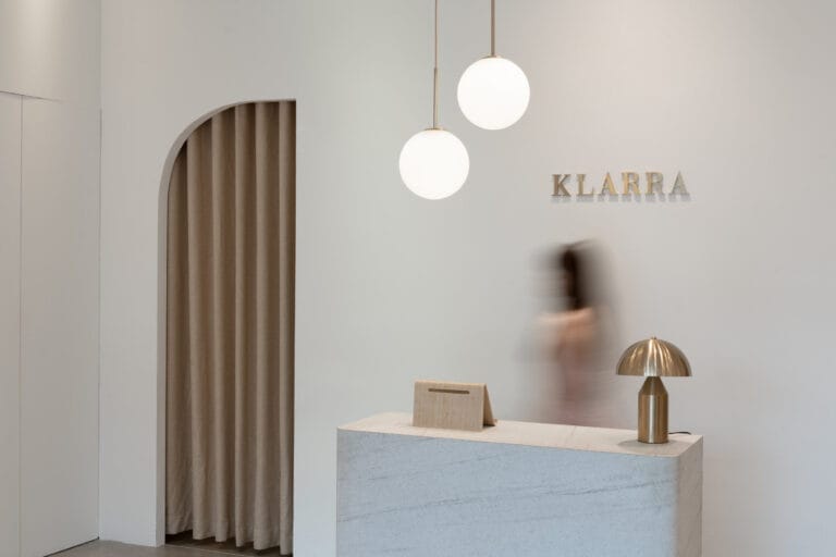
We were excited to be approached by local brand Klarra to renovate their pop-up store at The Shoppes, which was one of the more fast-paced and demanding commercial project we’ve undertaken so far! Our team was able to conceptualise and realise the entire space with a tight timeline, along with plenty of inspiration and creative input from our client as well.
The Brief
Our brief was to create a spatial concept that resonates with Klarra’s brand image – think elegant, modern silhouettes. We explored the idea of using sheer fabrics to mimic the soft flow of the feminine figure, contrasted against the rough, organic textures of stone and clay. We also wanted to bring in elements of nature, letting the viewer encounter pockets of plants as they move through the space.
Challenges
As with many short-lease retail spaces, the main challenge is to make full use of the existing finishes and structures, and in this case, a glass box located right at the entrance. This sharp rigid structure had to be softened down to blend in with our design concept, all while serving an important space given its location.

Materials and Furniture
Soft furnishing, such as the bouclé armchairs and ball lights, were chosen to create a welcoming and homely ambience, a stark contrast to adjacent stores with marble and glass.
Rather than having a fully open store concept, sheer fabric is installed at the entrance to entice curious customers to take a look inside.

The Waiting Lounge
As an existing enclosed space, the glass box was thus given the function of a waiting area for companions of shoppers, or a tea room on special days. White MDF was used to cover most of the glass box, leaving a curved window where sheer curtains can be drawn for more privacy at the seats.

A peek into the waiting lounge by the tea display
This curved window provides a viewing pocket to grab the attention of passerby from the storefront, while maintaining an airy feel.
With a creative play on opacity and materials, our team managed to transform a cold, rigid glass box to a soft and cosy experience.

Before: A cold and rigid glass box
Tea Display
Tucked along the left wall of the shop is a shelf area showcasing tea leaves from local brand Gentle Woman. Its design is kept clean to allow the foreground elements to stand out better. This curved wall gently hugs the center table, which can be converted into a tea table on special occasions.

Central Oasis and Cashier Counter
As a key feature of the store, the Central Oasis runs parallel to the main axis towards the cashier counter. The preserved flowers within the Oasis, and in vases peppered around the store, provide a delicate texture that ties back to the brand’s emphasis on inspiration from nature.
The minimalist counter, flanked by symmetrical half-archways, provides a clear visual direction amongst flowy, sheer drapes and organic forms.
KLARRA BY THE BAY (Closed)
Marina Bay Sands The Shoppes L1-68
2 Bayfront Avenue Singapore 018972
Check out the full gallery below, shot by Studio Mahogany


