‘A modern contemporary design, with muted and earthy colours that are consistent throughout the house’ was the main goal our clients came to us with. The brief was to have a proper entrance area leading into the home, and a spacious living room where they would spend most of their time hosting their loved ones or to relax on their own.
We customised built-in carpentry as much as possible to pull off the desired minimalistic aesthetic. Doors were concealed to blend into their surroundings, and vertical faces to match or compliment floor finishes to optically enlarge spaces.
Though modern contemporary in nature, the colors chosen for the home were made to be soft and neutral, and not completely sterile white. Hard finishes like tiles were scrutinised for an appropriate fit for the home’s overall shade.
The Living Room
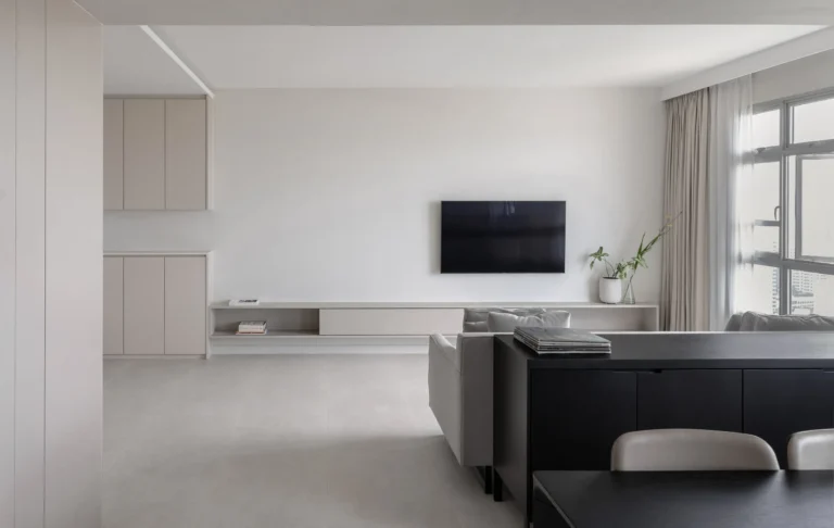
Without cutting the spaces up, a subtle entrance segregation was made through lowering the ceiling and having the shoe cabinet end along the same line. Walls for one of the bedrooms were collapsed for a spacious living/dining space.
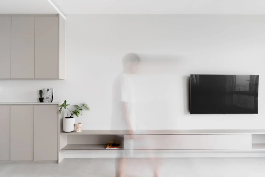
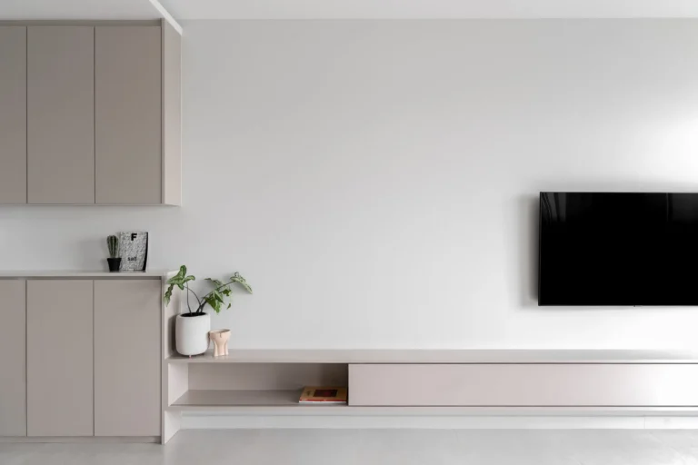
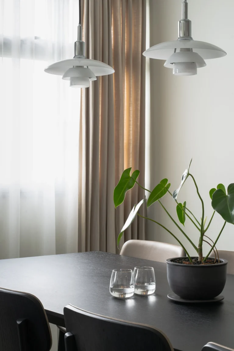
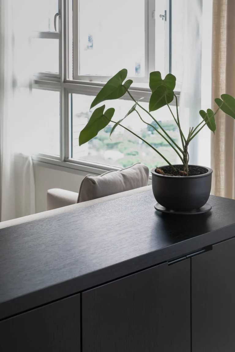
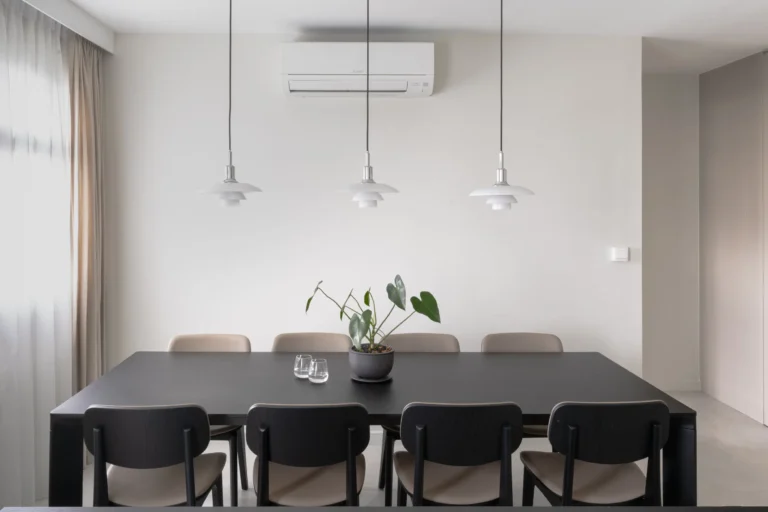
We blended white and black tones into the living room, giving a space for natural light to come in and permeate unhindered. The plants added at some corners soften the rigidity of clean lines and provide a calm and soothing feeling. And when the night falls, the warm lighting from the lamps will make it a comfortable space to unwind and have quality time with the family.
The Bedroom
Some other layout changes aside from integrating a room and the living space: a bedroom was converted into a walk-in wardrobe for more storage needs. We also changed up the original master bedroom entrance for more privacy, and a cleaner look from the perspective of the living room.
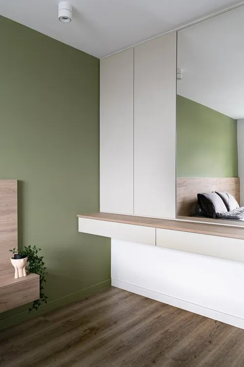
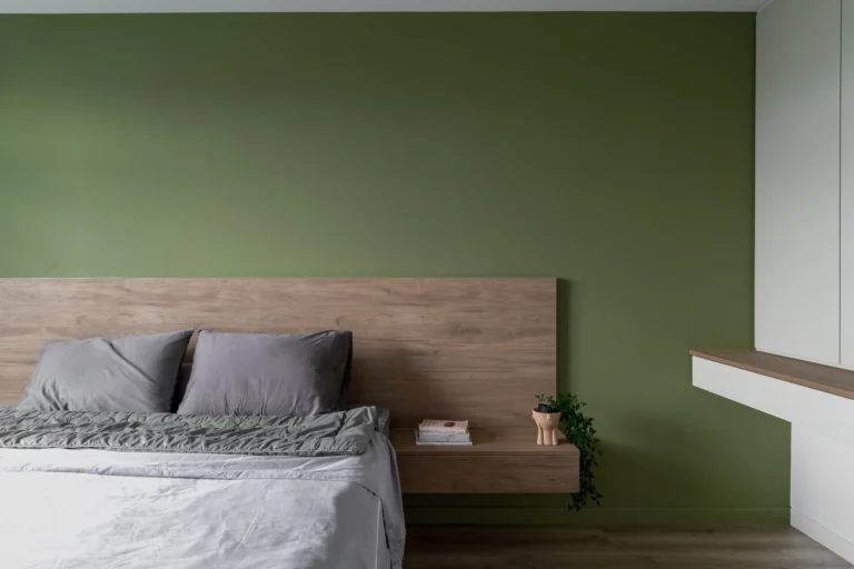
o complement the overall theme of the house, we chose a green and white palette for the master bedroom wall. Instead of placing a freestanding desk, a built-in vanity table is installed on the adjacent wall, strengthening the modern contemporary principle and giving more space to walk and move.
The vanity section was built with upper wall cabinets, adding more storage space while optimising the spaciousness of the room.
Bathroom
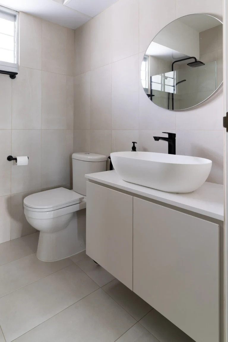
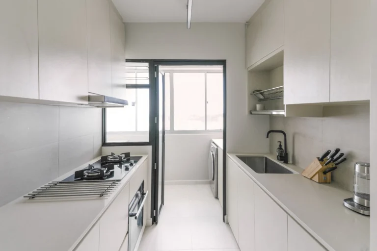
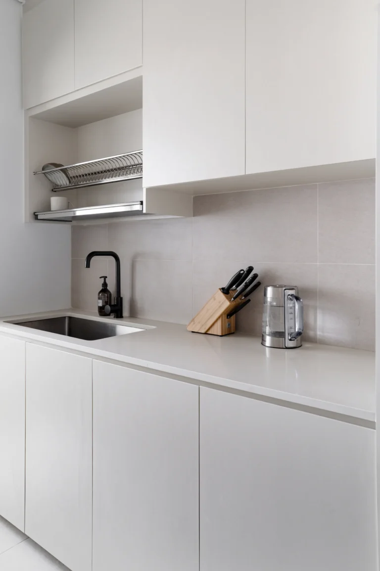
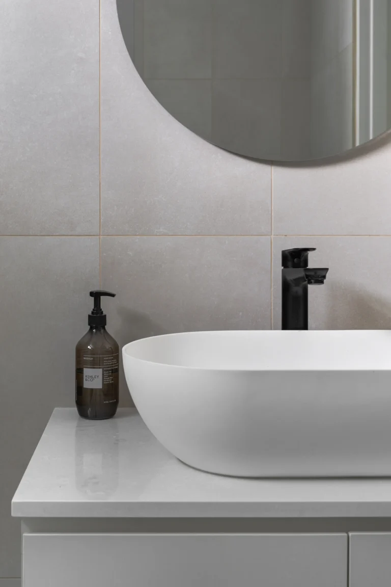
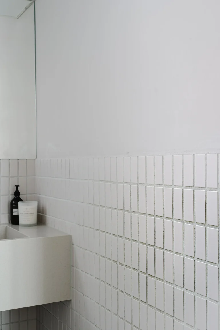
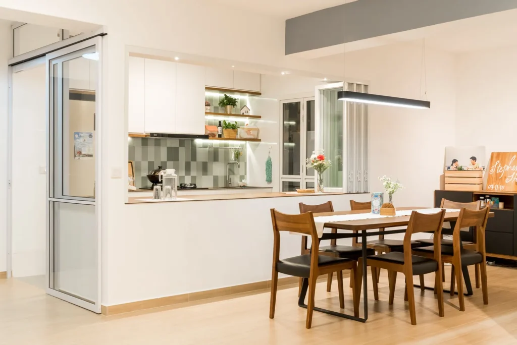
Uninterrupted, linear elements are a common concept throughout this home, which manifests in the living room as the long tv console and also repeated in the galley style kitchen. In the common bathroom that was designed as a powder room, a monolithic integrated sink and countertop spans the entire wall. Coupled with a full width of flushed wall mirrors, this humble bathroom is visually expanded for a great morning routine experience, and for visiting guests as well.
Interested to know more about this home? Check the full portfolio of our Henderson 95 project below.

