BuildBuilt is an interior design company with a twist. It has always been a dream to create a sister arm that dabbles in food and beverages and translates BuildBuilt’s current services into a space that further showcases its creativity and warmth. Developed as BuildBuilt’s off-shoot, Buttered Bread is a spin-off from our physical studios, made to also display our obsession with beautiful interior experiences and …food! Serving our customers with the best coffee and churros in town, Buttered Bread is a quiet, cosy yet playful space intended for tired souls who want an escape from the hustle and bustle of life.
Design Concept

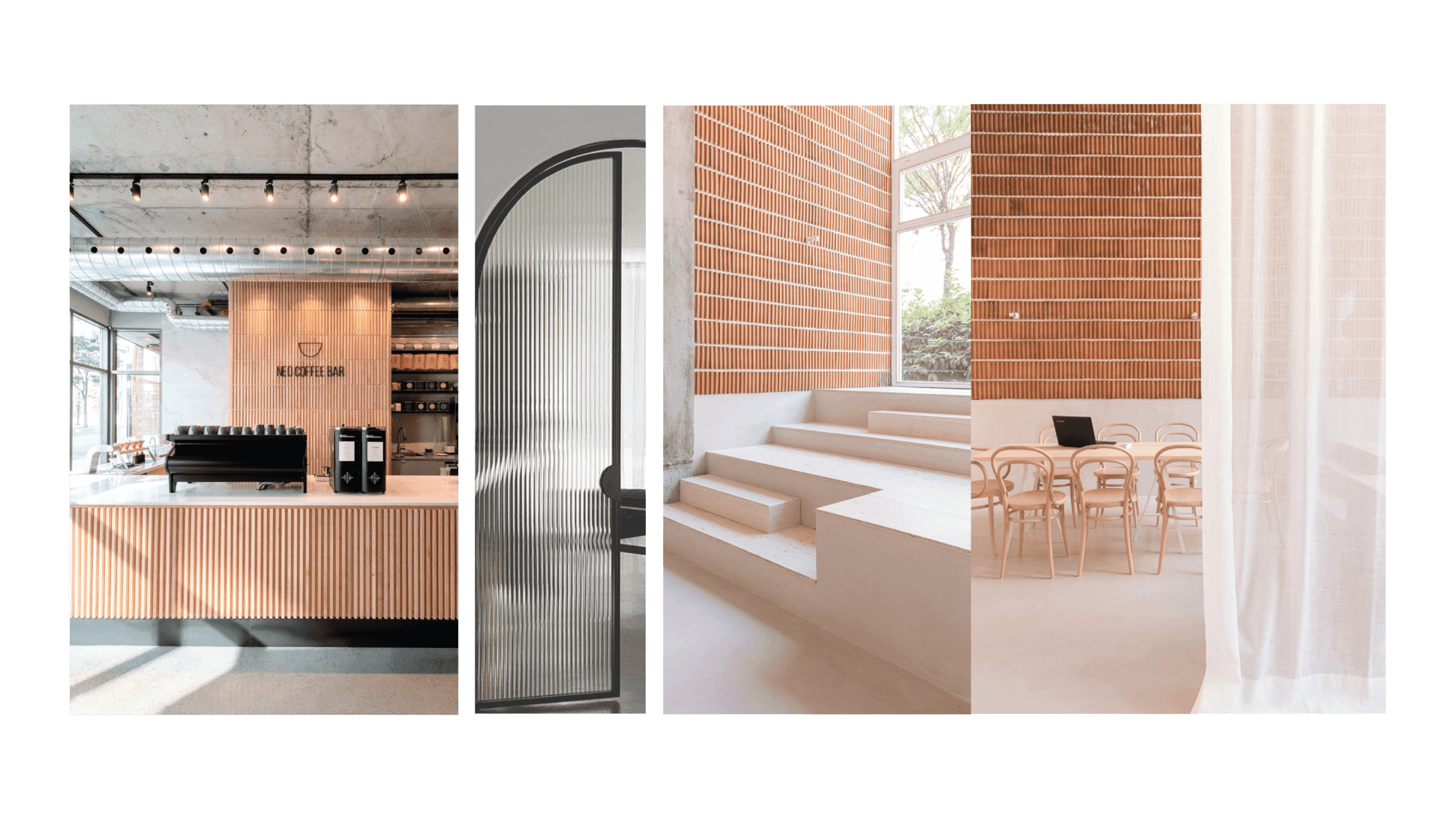
Image credits (from left): Neo Coffee Bar, Reeded Glass Door, Restaurant K&Co
As inspiration, we selected main features from BuildBuilt’s existing studios to migrate into the café’s concept.
To allow BuildBuilt’s culture of playfulness to shine through, we experimented with the assimilation of different ideas within the menu, ceiling treatment and the general interior’s materials.
We endeavoured to preserve BuildBuilt’s existing ‘homey workshop vibe’ by opting for carpentry with a “self-built” or DIY appearance, as opposed to the usual clean, sleek aesthetics.
Main Features
Open-Concept Kitchen
Again, taking direction from BuildBuilt’s work philosophy of forging genuine relationships with their clients, and promoting a ‘show it all’ policy, the café shares the same open-floor concept.
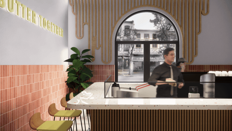
An open-concept kitchen greets customers near the entrance. Heard are the murmurs of conversation between customers and baristas over the polished counters, basked in soft beats, and the clanking of coffee equipment. The fragrant waft of fried churros fills the air.
The merchandise shelves and textured walls lead the eyes back into the deep, elongated form of the café.
Semi-Private Area
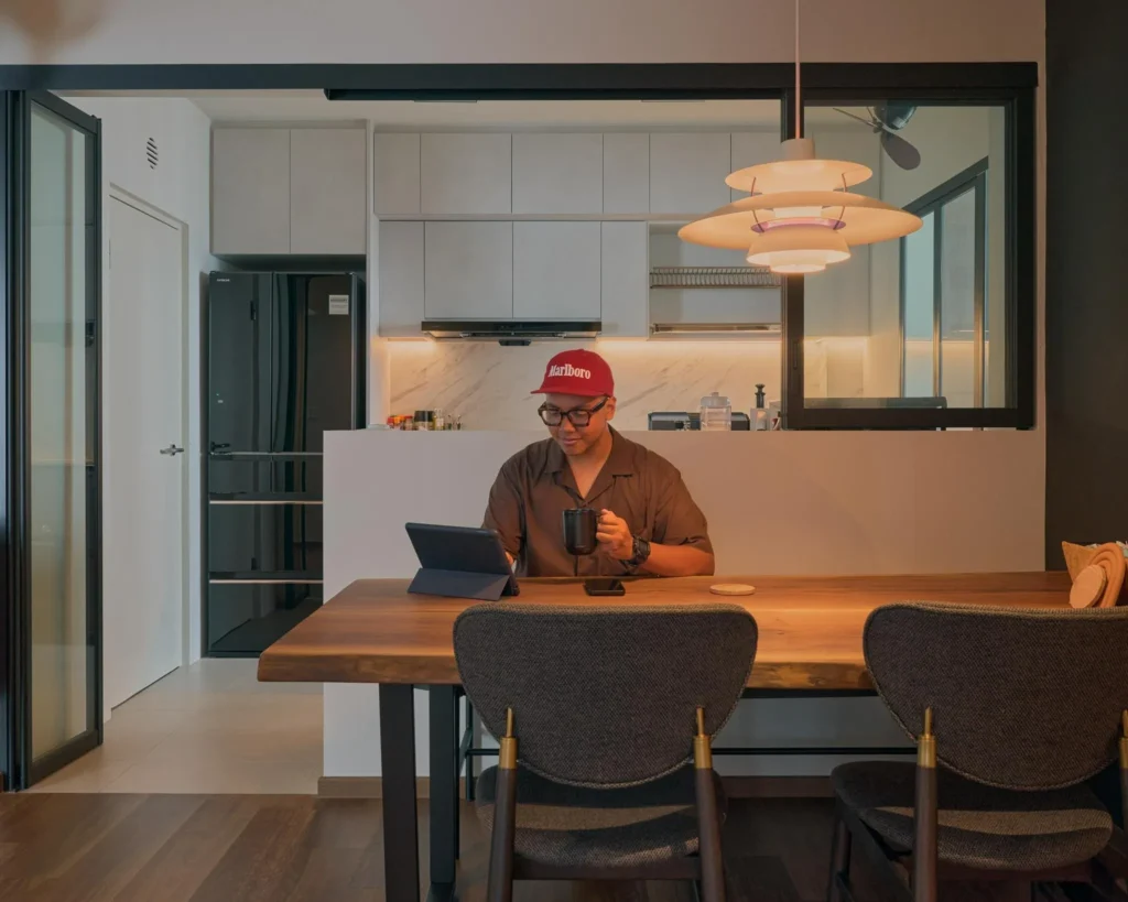
Attempting to create a multi-functional space, we cut out a small portion of the café’s footprint to create a semi-private space dedicated for work, either individually or in groups. It also leads to the main kitchen as the placement allows for a direct circulation route for the café staff.
Main Dining Space
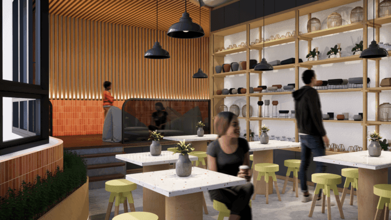
The mid-body of the café is a hub dedicated to dining and interaction. The strategic arrangement of the merchandise shelves allows patrons to window-shop while enjoying their meals.
Lounge
Navigating even deeper into the café, the raised floor level creates a platform segregating the main dining space from the relaxation area. The light wooden palette chosen for this corner emulates airiness and cosiness. Walking into the lounge area reveals a concealed area that allows customers to have a more secluded space for privacy.
Ceiling Treatment
Notably, the ceiling treatment is the cherry on top that ties the entire space together. It flows upward from the main entrance, running organically along with the ceiling before cascading down on the brick wall at the lounge. Furthermore, the intentional placement of the lighting shining upwards accentuates the height of the space.


