An open kitchen is great for making boxy spaces look extra airy and spacious, but we know that it involves a lot of upkeep for everyday maintenance. With a strategic layout and use of materials, this 5 room BTO in Bidadari is designed with lots of opportunities to transform from a homely abode to party-ready space in a heartbeat.
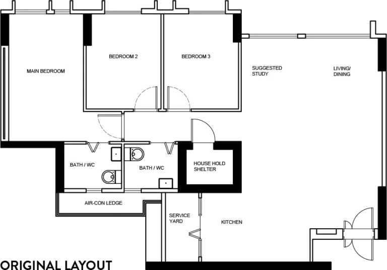
The site
The wall between the master and spare bedroom is hacked to create an open area for a study setup, an additional wardrobe and a couch to be within the same space.
This hacked wall can also be sealed up in the future if there is a need for the extra room, which is why the original door was retained.
Material Palette
Our clients wanted medium-toned wooden floors, white walls and beige tones all around to create a comforting space for years to come.
Neutral, beige sandy colours with black accents we chosen for the various finishes and accessories as well.
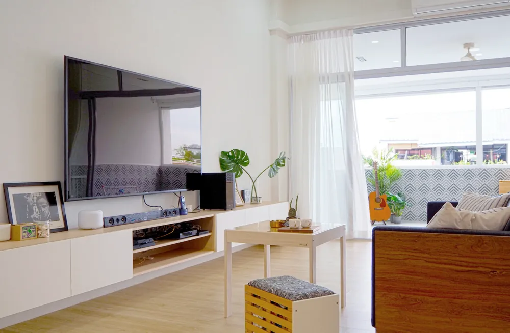
Integrated TV console
The main living area is oriented towards the long TV console spanning almost the entire wall, which is integrated with a tall shoe cabinet. Arched rattan infills decorate the doors, to imbue a sense of airiness as well as to practically ventilate the cabinet. This great storage solution for long term use can also act as a bench for when the family wears or takes off their shoes!
Kitchen
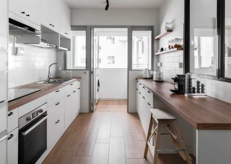
For a functional kitchen, a windowed wall was constructed to separate it from the dining area, with a huge glass sliding door to keep it visually open.
There is also a dedicated breakfast counter by the sliding windows, which serves to connect to the main dining table when there are more guests around.
Wood textured floor tiles were picked to match the floor vinyl outside, which are easier to clean up after an intense cookout session.
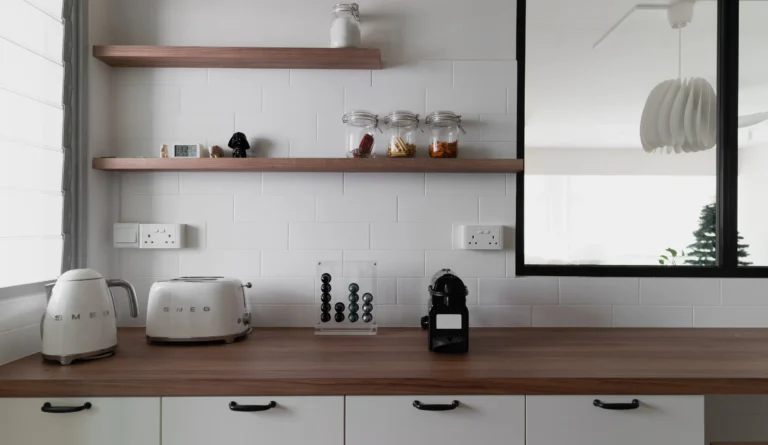
With top cabinets only on the left side of the space, condiment jars are displayed out on matching narrow shelves against a classy backsplash of subway tiles.
Master Bedroom
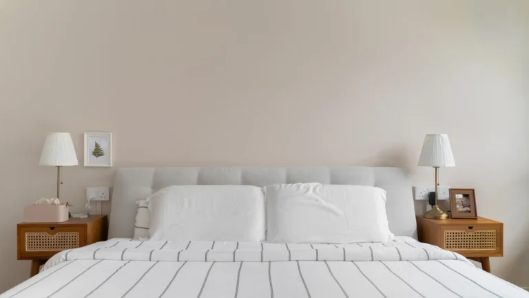
The master wardrobe is designed with a curved corner where it faces the entrance to gently open up the rest of the room when one enters. Built-in furniture is kept minimal here, with majority of the wall washed with a soft beige to bring brightness and warmth at the same time.
Left: The main wardrobe by the bed. Right: A longer, full height storage in the spare / study room
The 2 bathrooms follow a similar colour palette as the rest of the home, with slight variations between them. To keep within the budget, walls were tiled halfway to protect the wet areas, while the rest upper half is painted with the gentle beige colour.
The master bathroom has an advantageous layout where a full walk-in shower can be placed on one side, while a wall-to-wall mirror helps to further amplify the space. This mirror terminates with a beautiful slim shelf, which our clients can use as an extension of the vanity space.
Check out the full gallery below, shot by Studio Mahogany


