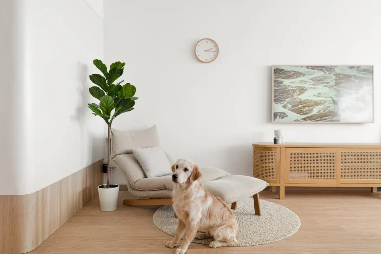
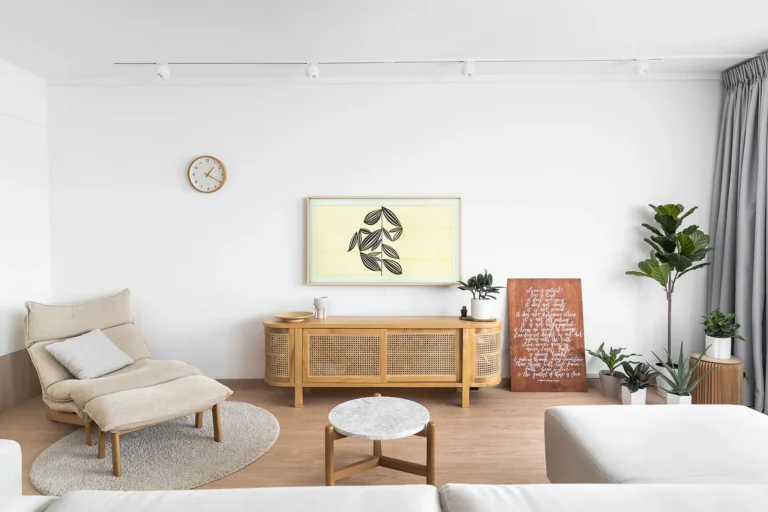
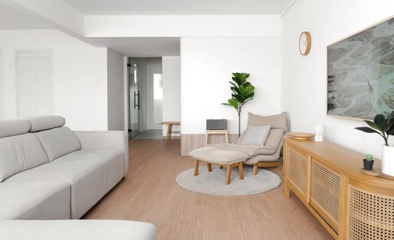
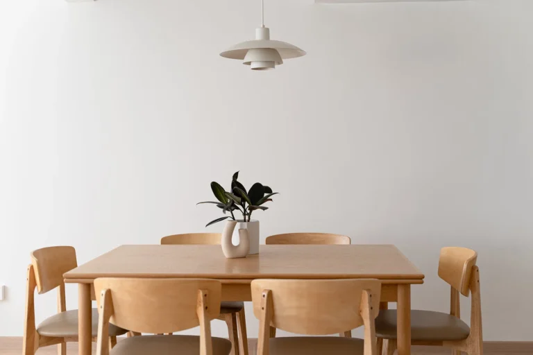
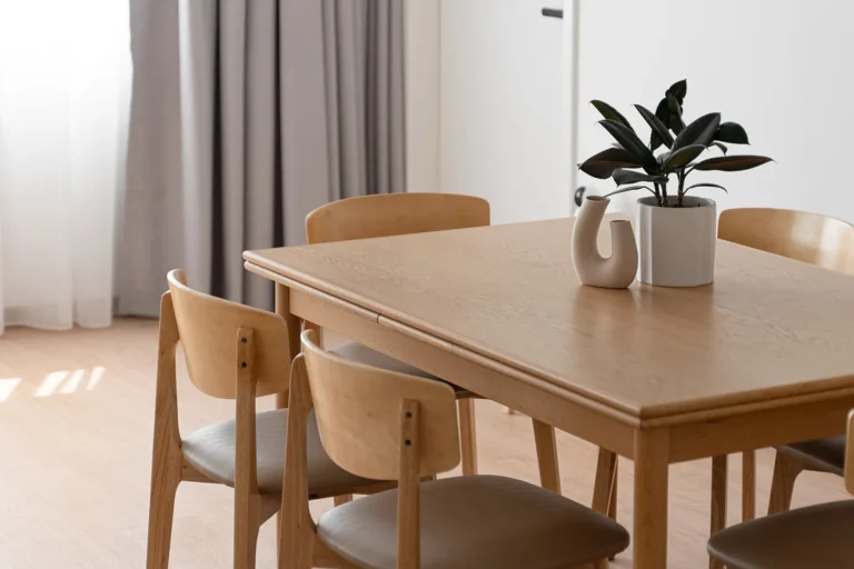
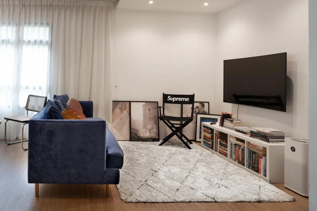
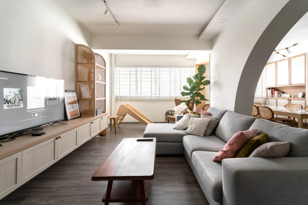
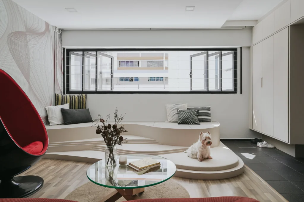
A cosy sanctuary; a clean, light-filled space with warm touches. A spacious home anchored by custom built-ins with the freedom to switch up with loose furniture. We first embarked on this journey to reconfigure the layout with an open-concept makeover by eliminating odd ends and corners.
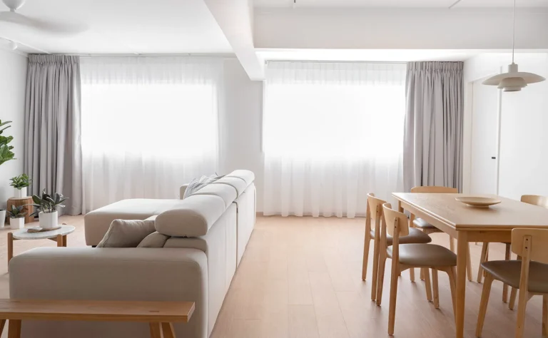
The key highlight of the 5-room resale unit is the beautiful sunset view from the living room that was not fully optimised. By expanding into the balcony and pushing back the kitchen wall, we achieved a more spacious living and dining area, and even carved out an additional entryway nook!
Left (After): Full view of the outside from anywhere in the living room. Right (Before): Boxed up balcony area that blocks out the view partially
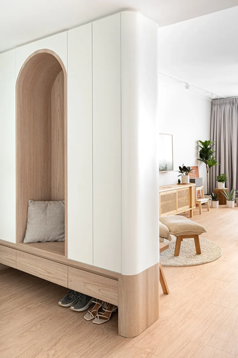
The functional entryway helps with privacy from the neighbours, has a generous storage space and is shaped around the convenience of everyday traffic, all while keeping to the minimalist theme. The kitchen was also re-envisioned to suit the client’s function, with a new separate laundry/yard space created.
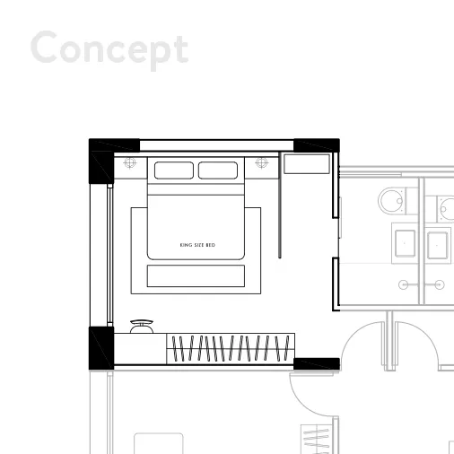
Process visual of the initial layout for the bedroom
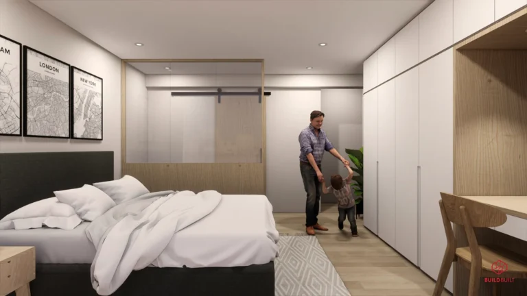
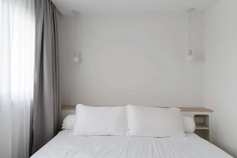
One must-have in the design brief was a walk-in wardrobe in the master bedroom. This was certainly a deliberation considering the space limitations – but we made it work! After many challenging rounds to configure the best layout of the bedroom, the final decision was to go with a built-in headboard providing for their bedside storage needs, creating more space for the wardrobe walkway.
With it being an enclosed area, good lighting fixtures were paramount. We also brought in the same bright palette into the bedroom, with some wood accents for contrast. A full length mirror helps to visually expand as well as brighten up the area.
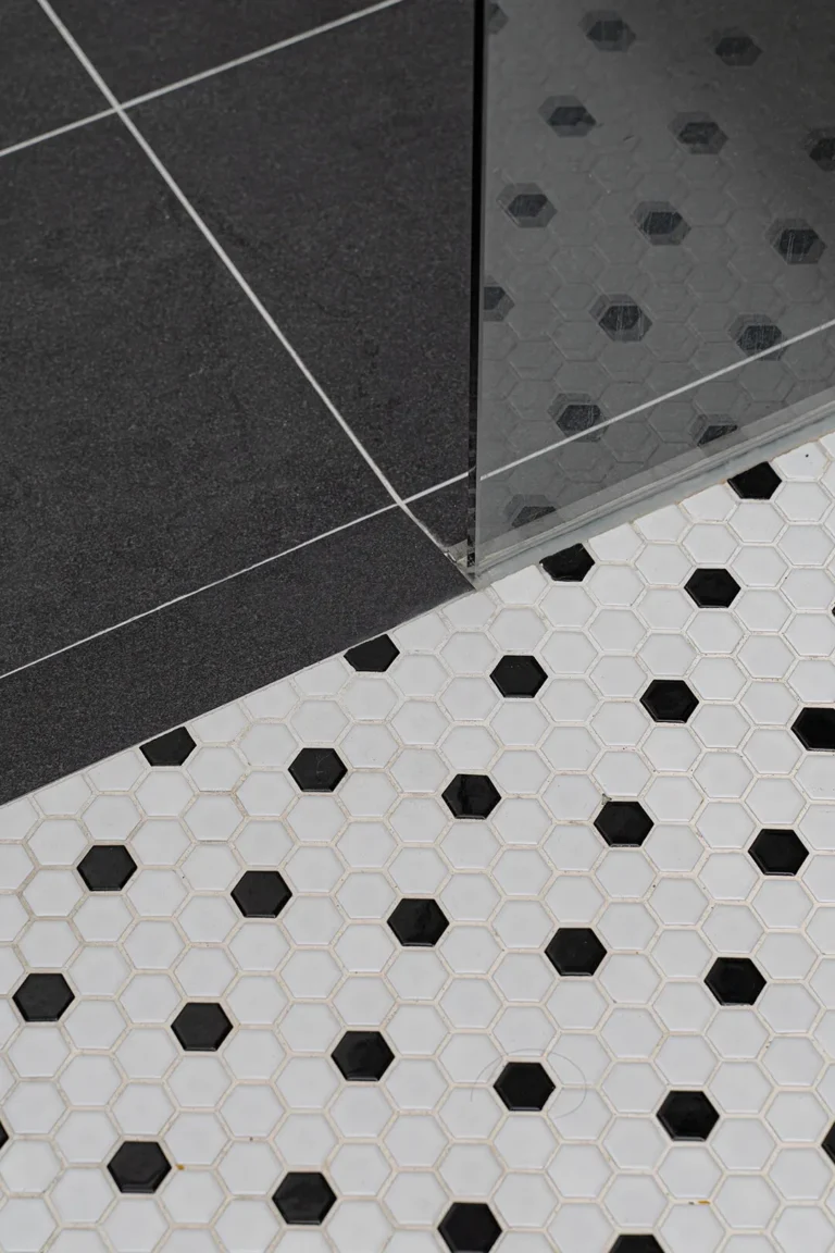
The bathrooms are an extension of the main living areas, with a little twist. We brought in the same monochromatic scheme with the light wood laminate, but with patterned tiles adding some personality to the space.
Check out the full gallery with the couple’s new happy family member! Photos by Studio Mahogany


